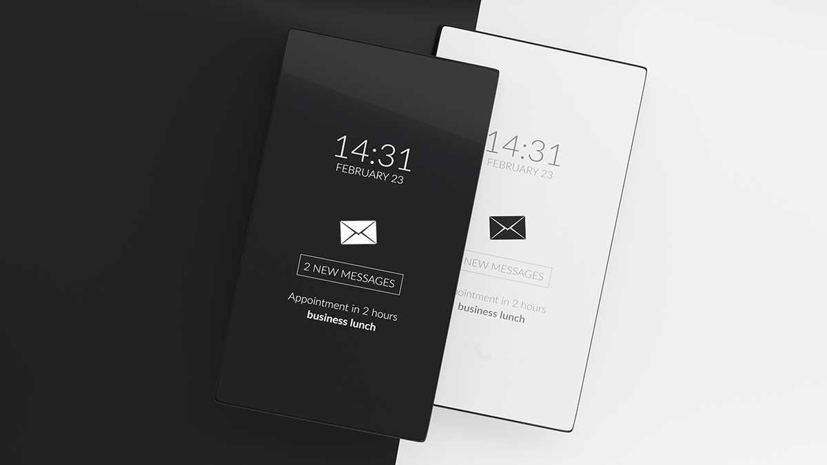
Our digital lives are now glued to a screen for any given amount of time throughout the day, no matter what one does for a living. We were given settings to select a mode for our devices. Humans do love having options, but that gets one thinking which one is better? And so began the great debate and loads of internet research on the differences between light and dark mode.
Since the 1970s, CRT technology introduced the original dark mode. It was not strong enough to illuminate an entire screeen, so only some characters were lit, giving rise to the first computer screens with a black screen with green or white pixels lit up for display. The evolution of user interfaces made this obsolete as technology allowed for more colors and LCD enhancements in the mid 2000s bringing in the age of light mode. As the pendulum swings we’re back to including dark mode, but why?
Fast forward technology to the last decade with the rise of OLED technology, integrated power saving methods, and the inclusion of all walks of life through web accessibility. Technology has aged faster than we do, so accessing this technology for those of different ages and impairments has become a high priority for many industries. The device creators themselves have implemented methods to make the most out of those devices. In an OLED screen it’s as easy as turning it off to not spend energy on lighting up the screen and this is where dark mode sees its resurgence.
Pros & Cons
While many people feel more comfortable using dark mode in dimly lit conditions, it’s not always the best option.
Humans are adapted to seeing things more clearly in the day and not so much at night. We have evolved to see dark on light, whether objects in our natural surroundings during daylight or written text. So in the most primitive sense we were built to see contrast, it’s better for us to see dark on light rather than the other way around.
An important point against using dark mode for better visibility is that the light emitted in dark mode — especially for text — is not necessarily good for everyone as in individuals with astigmatism. Nearly 30% of varying populations suffer from different degrees of the condition. Part of this has to do with light levels: with a bright display (white background) the iris closes a bit more, decreasing the full strength of the lens; with a dark display (black background) the iris opens to receive more light and the affected lens loses some focus and creates a hazy fuzz around the brighter objects on screen.
That is not always the case for everyone with light astigmatism or other visual impairments. Pretty much the user preference relies on if they suffer from any fuzzy or blurring of edges with white text on a dark background. For UI/UX purposes, we simply need to allow the user to have that option. If they do not feel bothered by any visual issues and prefer dark mode then they may have the option, otherwise it is perfectly fine to stick with light mode.
Media Queries
One quick and simple approach to gaining control over light and dark mode is applying a CSS media query for elements. This feature checks the device preferences and applies styles according to the user preference. If the user has their computer or mobile device set to either light mode or dark mode, the styles will change accordingly.
                @media screen and (prefers-color-scheme: dark) {
                    // Add dark mode styles
                }

                @media screen and (prefers-color-scheme: light) {
                    // Add light mode styles
                }
Stylesheets
Depending on a project’s complexity, media queries may be added directly to the stylesheet where changes are required. Web applications and preferences for independent dark or light mode options may require a more non-critical CSS loading method. To minimize loading, we will first conditionally check and load the preferred stylesheet — light.css or dark.css as examples — then load the standard stylesheet, global.css in this example. For any browsers that do not detect the device option for light mode or dark mode, we add a script above to make sure we load one or the other as our priority option.
                // Check to see if the browser supports modes and if not defaults the 'light' stylesheet as highest priority
                <script>
                    if (window.matchMedia('(prefers-color-scheme: dark)').media === 'not all') {
                        document.documentElement.style.display = 'none';
                        document.head.insertAdjacentHTML(
                            'beforeend',
                            '<link rel="stylesheet" href="/light.css" onload="document.documentElement.style.display = \'\'">'
                        )
                    }
                </script>

                // Conditionally load the stylesheet that correlates to the preferred color scheme
                <link rel='stylesheet' href='/dark.css' media='(prefers-color-scheme: dark)' />
                <link rel='stylesheet' href='/light.css' media='(prefers-color-scheme: light)' />

                // The standard stylesheet
                <link rel='stylesheet' href='/global.css' />
Best practices should include adding more checks to dark mode and light mode. Accessibility, image contrast, avoidance of pure white or black, and a good eye for design are now required for checking and testing in all modes and environments. There may be more work added, but in the end the user experience is greatly enhanced.
